keywords in this article: Scatter Plot, Covariance, and Correlation Coefficient
The words “scatter plot,” “covariance,” and “correlation coefficient” seem a little daunting to those who are just beginning to learn statistics.
These are important tools for numerically capturing the “relationships” that exist in our daily lives. In this article, we’ll break down these ideas using familiar, real-life examples — so even if you’re brand new to statistics, you’ll feel confident exploring them with us!
What is a scatter plot?
Let's talk about "scatter plots.”
A scatter plot is like a map that shows how two things move together. For example, let's consider two pieces of information: “study hours per day” and "test scores."
Suppose we have data for six students in a class as shown below:
| student | study hours per day | Test score |
| A | 1 | 45 |
| B | 2 | 55 |
| C | 3 | 60 |
| D | 4 | 65 |
| E | 5 | 80 |
| F | 6 | 85 |
When this data is graphed, the horizontal axis is “study time” and the vertical axis is "test scores."
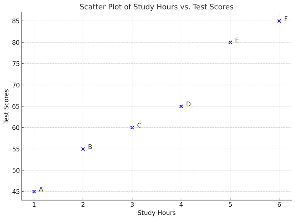
By hitting each student's data as a dot, we can see a trend that the longer you study, the higher your test score may be. Thus, a scatter plot is a graph to visually confirm the relationship between two sets of data.
The perspective of looking at variation with respect to the average
Scatter plots are graphs that visualize the relationship between two variables, and the important thing in reading them is to “think in terms of the average of each”.
The graph below is an enhanced version of the earlier scatterplot, with the addition of average study time (green dotted line) and average test scores (red dotted line)."
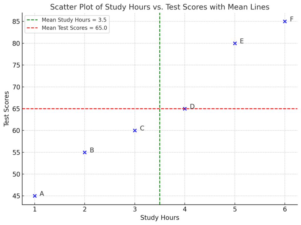
This average line shows the “central value” of each variable. Using these two lines as a baseline, we can visually capture how much each student's data deviates from the average and what patterns there are in the deviations.
For example, student F, who is in the upper right corner, is well above average in both study time and test scores. Thus, it can be said that there may be a relationship (correlation) between the two variables, such that an increase in stdy time increases test scores.
Howver, even if you think that there seems to be some relationship between two data in a scatter plot, it is not enough to judge it by just looking at it. Covariance is a numerical expression of the” degree of change together" of the data.
What is a Covariance?
The concept of covariance is easier to understand visually.
If a person spends more time studying than the average and his/her test score is also higher than the average, we can say that the two values vary in the same direction.
Conversely, if someone spends more time studying than average but scores lower, we can say that the two values are dispersed in the opposite direction.
To visualize this in a diagram, we can create something like the area of a small rectangle to show how far each point is from the average.
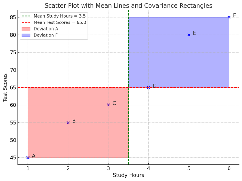
In the figure above, we have added red and blue squares to the previous scatterplot. Each rectangle shows how far away from the average the student's study time and test scores are.
For instance:
- The purple rectangle represents Student F where “both study time and test scores are greater than average,” where the deviation resonates in the positive direction.
- The red rectangle represents Student A where “both study time and test scores are less than average.” Again, the direction is the same, but the values are on the negative side. This also implies a positive correlation.
- On the other hand, if a student studies more than average but scores lower than average — or studies less but scores higher — their data point falls into the upper left or lower right quadrant. In these cases, the deviations move in opposite directions, which results in a negative correlation. This means that as one variable increases, the other tends to decrease.
In fact, the rectangle's area visually represents how much two variables change together, which is the essence of covariance.
Sum of the rectangle = Covariance !
Earlier, we told you that the red and blue rectangles drawn on the scatter plots are connected to the idea of covariance.
Let's take a closer look.
For each data point, we take the deviation from the average of the horizontal (x-axis: e.g., study time) and vertical (y-axis: e.g., test scores). The area created by this “horizontal x vertical” is an image of the “resonance of variability” of a single data point.
To obtain the covariance, the areas for all data points are summed and then divided by the number of observations.
The formula is:
$$\mathrm{Cov}(X, Y) = \frac{1}{n} \sum_{i=1}^{n} (x_i - \bar{x})(y_i - \bar{y})$$
The content of this formula is exactly “horizontal × vertical” = “product of deviations” and corresponds to the area of each rectangle shown in the figure.
What the sign of covariance indicates
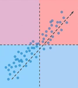
A positive (plus) covariance value means that there is a lot of data that “varies in the same direction,” such as when X is greater than the mean, Y is also greater, or when X is smaller, Y is also smaller. In a scatter plot, this means that there are many points in the upper right and lower left quadrants.
Conversely, if the covariance is negative, it means that when X is large, Y is small, or vice versa, and the data tends to scatter in the opposite direction. This means that points tend to cluster in the lower right or upper left quadrant.
And if the points are evenly scattered in the upper right, lower left, lower right, and upper left quadrants, the positive and negative deviations will cancel each other out and the value of covariance will approach zero. In such a case, we can conclude that there is no relationship between the variance of X and Y.
The Disadvantages of Covariance and the Emergence of the Correlation Coefficient
However, covariance has one major drawback: it depends on the units of measurement.
For example, when examining the relationship between height and weight, the value of the covariance will differ depending on whether height is measured in centimeters (cm) or feet (ft). This is problematic because the underlying relationship between the variables remains the same, even though the numerical value of the covariance changes due to the units.
This is where the correlation coefficient becomes useful. The correlation coefficient is calculated by dividing the covariance by the product of the standard deviations of the two variables. This process standardizes the value and removes the effect of differing units, allowing for comparisons across datasets.
Pearson's Correlation Coefficient Formula
$$r_{XY} = \frac{\mathrm{Cov}(X, Y)}{\sigma_X \cdot \sigma_Y}$$
Alternatively, it can be expressed based on the product of standardized deviations:
$$r_{XY} = \frac{1}{n} \sum_{i=1}^{n} \left( \frac{x_i - \bar{x}}{\sigma_X} \right) \left( \frac{y_i - \bar{y}}{\sigma_Y} \right)$$
- \(r_{XY}\): Correlation coefficient between X and Y
- \(\mathrm{Cov}(X, Y)\): Covariance between X and Y
- \(\sigma_X, \sigma_Y\): Standard deviations of X and Y
- \(x_i, y_i\): The i-th data points for X and Y
- \(\bar{x}, \bar{y}\): Means of X and Y
- \(n\): Number of data points
It measures the strength and direction of the linear relationship between X and Y in a unit-independent way.
Think of the correlation coefficient as a score between -1 and +1 that tells you how closely two things are dancing together — perfectly in step, in opposite directions, or not at all. Closer to +1 indicates a “strong positive relationship,” closer to -1 a “strong negative relationship,” and closer to 0 a "little to no relationship.
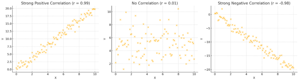
For example, a correlation coefficient of +0.9 means that the relationship is very strong, such as the more time one spends studying, the higher the test score.
On the other hand, if it is -0.8, it means that the relationship is stronger in the opposite direction, such as the more time one spends studying, the lower the test score. If the points are scattered apart, the correlation coefficient is close to zero.
The correlation coefficient can only capture linear relationships.
As we have seen, the correlation coefficient is a very useful indicator that shows “how well two variables move together” in the range of -1 to +1.
However, the correlation coefficient can only capture linear relationships.
For example, if the relationship between X and Y is curvilinear, like parabola - that is, Y rises once as X increases and then falls again - the correlation coefficient will not represent the relationship well.
This is because the correlation coefficient is based on the normalized product of the deviations of X and Y, reflecting how consistently they move in the same direction. In other words, it is assumed that the relationship between X and Y is linear from beginning to end.
Therefore, even if there is a clear relationship between X and Y, if it is curvilinear, the correlation coefficient will capture almost nothing and may be judged as "no relationship”.
If you wish to examine a nonlinear relationship, it is very important to observe the scatter plots themselves carefully, rather than relying solely on the correlation coefficient.
Correlation is not a “causal” relationship
Just because there is a strong correlation does not mean that there is a cause-and-effect relationship.
For example, on hot summer days, both ice cream sales and electricity usage tend to go up.
At first glance, it might seem like eating more ice cream causes people to use more electricity.
But in reality, both are increasing for the same reason: high temperatures.
Thus, even when the correlation coefficient is high, there may be another factor behind it.
So, what can we do if we want to find the true relationship between two variables without being misled by an apparent correlation?
In such cases, we use the partial correlation coefficient to remove the effect of a third variable and see the real connection more clearly.
Partial Correlation Coefficient
In the example of ice cream sales and electricity consumption, we can remove the effect of temperature and see if there is still a correlation.
Partial Correlation Coefficient is used to know the “true relationship” between X and Y after removing the influence of the third variable Z.
The formula is a bit complicated, but you can think of it as "removing another factor in between” to see if the two variables are really related.
Formula for Partial Correlation Coefficient and its Meaning
The partial correlation coefficient is expressed by the following formula:
$$r_{XY \cdot Z} = \frac{r_{XY} - r_{XZ}*r_{YZ}}{\sqrt{(1 - r_{XZ}^2)(1 - r_{YZ}^2)}}$$
What you see in this equation means, respectively
- \(r_{XY \cdot Z}\): partial correlation coefficient between X and Y, removing the effect of Z
- \(r_{XY}\): Correlation coefficient between X and Y (apparent correlation including the effect of Z)
- \(r_{XZ}\): correlation coefficient between X and Z
- \(r_{YZ}\): correlation coefficient between Y and Z
The word "partial" has the nuance of "removing a part of the relationship," and it is a measure of the "pure relationship" that remains after cutting out the part of the relationship between X and Y that is related to Z.
Thus, the partial correlation coefficient is a very important analytical method to determine the true relationship, not the apparent relationship.
The figure below visualizes the relationship between ice cream sales, electricity consumption, and temperature.
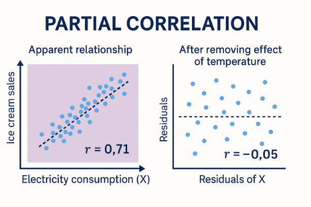
- The graph on the left is a scatter plot showing the apparent relationship between electricity consumption (X) and ice cream sales (Y). It looks like they are strongly related, with a correlation coefficient of about r ≈ 0.71.
- The graph on the right shows what happens after removing the effect of temperature (Z). The partial correlation coefficient is very small, around r ≈ -0.05, which means that X and Y don't actually have a strong direct relationship.
Conclusion

Scatter plots, covariance, correlation coefficient, and partial correlation coefficient are very important concepts in statistics to capture the “relationship” among data.
By mastering these concepts, you will be able to notice “connections” and “hidden factors” in the background of the data.
We encourage you to try drawing scatter plots and calculating correlation coefficients using familiar data to get a sense of exploring “relationships” with your own hands.
Why not try exploring your own data — maybe your sleep habits or daily steps — with a scatter plot? You might just uncover surprising patterns waiting to be discovered!

コメント