Why Learn Basic Statistics?
Have you ever gathered a lot of data — maybe test scores, exercise results, or sales numbers — and wondered how to make sense of it all?
Learning a few key statistical concepts can make a huge difference.
This article is designed for beginners who want to understand basic statistics, covering important ideas like the mean, variance, standard deviation, standard scores (z-scores), coefficient of variation, and box plots.
By the end, you will be able to describe your data clearly and even compare different types of data fairly.
- Understanding the Mean: Finding the Center of Your Data
- Exploring Variance and Standard Deviation: How Spread Out Is Your Data?
- What Is a Standard Score (z-score)? : Comparing Across Different Data Sets
- Understanding the Coefficient of Variation (CV): Measuring Relative Spread
- Quartiles and Box Plots: Visualizing Data Distribution
- Common Mistakes Beginners Make in Statistics
- Quick Self-Checklist to Avoid Common Statistical Mistakes
Understanding the Mean: Finding the Center of Your Data
One of the first things we often ask when looking at a set of numbers is the mean — also known as the average or "the center of your data."
The mean is calculated by adding up all the data values and dividing by the number of values:
$$\bar{x} = \frac{1}{n} \sum_{i=1}^{n} x_i$$
In this formula,
- \(∑\) represents the sum
- \(n\) is the number of data points
- \(x_i\) refers to each individual data point from 1st to \(n\)th
For example, if your data points are:
12, 15, 20, 22, 18, 30, 25, 16, 19, 21then the mean is:
$${Mean} = \frac{12 + 15 + 20 + 22 + 18 + 30 + 25 + 16 + 19 + 21}{10} = 19.8$$
The mean acts like the "center of gravity" for your data.
However, it's important to note that the mean is sensitive to outliers — unusually too high or too low values from the mean.
Even a single outlier can pull the mean upward or downward.
That's why, in some cases, other measures like the median may give a more accurate picture of the "typical" value.
Exploring Variance and Standard Deviation: How Spread Out Is Your Data?
Knowing the center is important, but it’s equally important to know how scattered the data is.
Did all the values cluster close together, or were they spread far apart?
To answer that, we use variance and standard deviation.
What is Variance?
The formula for variance is:
$$s^2 = \frac{1}{n} \sum_{i=1}^{n} (x_i - \bar{x})^2$$
For each data point, you:
- Subtract the mean from each data
- Square the result
- Add up all these squared differences (that's \(∑\) stands for)
- Divide by the number of data points
Variance measures how much the data points differ from the mean.
You might notice from the fomula that it squares the differences.
Why square the differences?
Squaring ensures that positive and negative differences don’t cancel each other out, and it also gives more weight to larger differences.
However, variance changes the units.
If your original data is in centimeters, the variance will be in square centimeters (\(cm^2\)), which is not easy to interpret.
Standard Deviation
To fix this squared unit problem, we use the standard deviation, which is simply the square root of the variance:
$$s = \sqrt{s^2}$$
This brings the units back to the original (e.g., \(cm\) instead of \(cm^2\)).
If the standard deviation is small, the data points are close to the mean.
If it’s large, the data points are more spread out.
Thus, the standard deviation gives us a clear, intuitive sense of data dispersion.
What Is a Standard Score (z-score)? : Comparing Across Different Data Sets

Sometimes, you might want to compare different kinds of data — for example, your scores in English and Math, where the averages and spreads are different.
This is where the standard score, or z-score, comes in handy.
The z-score is calculated with the following formula:
$$z = \frac{x - \bar{x}}{s}$$
In words:
subtract the mean from your value, then divide by the standard deviation.
The z-score tells you how many standard deviations away your value is from the mean.
- A z-score of 0 means you are exactly at the mean.
- A positive z-score means you are above average.
- A negative z-score means you are below average.
Using z-scores allows you to compare performances across different tests or measurements fairly, even if their scales are completely different.
Imagine you took a Math and an English test.The Math test is scored out of 100 points, and the English test is scored out of 200 points.
Clearly, you can’t just compare your raw scores directly — the maximum scores and the difficulty levels are different.
Suppose your scores are:
- Math test: 80 points (out of 100)
- English test: 150 points (out of 200)
At first glance, it looks like you did better in English because 150 is a bigger number than 80.But is that really true?
If:
- The average Math score was 70, with a standard deviation of 5.
- The average English score was 140, with a standard deviation of 20.
For Math:
$$z_{math} = \frac{80 - 70}{5} = \frac{10}{5} = 2$$
Your Math z-score is 2.
This means your Math score is 2 standard deviations above the mean.
For English:
$$z_{english} = \frac{150 - 140}{20} = \frac{10}{20} = 0.5$$
Your English z-score is 0.5.
This means your English score is only half a standard deviation above the mean.
Even though your raw English score (150) looks higher than your Math score (80), your performance relative to others was actually better in Math!
Without z-scores, you might have thought you performed better in English.
But thanks to standardizing the scores, you can clearly see you excelled more in Math
Understanding the Coefficient of Variation (CV): Measuring Relative Spread
Another useful concept is the coefficient of variation (CV).
While the standard deviation shows how spread out the data is, it does not account for the scale of the data.
The CV adjusts for this by dividing the standard deviation by the mean:
$$CV = \frac{s}{\bar{x}}$$
The CV shows how large the standard deviation is relative to the mean.
This is particularly helpful when comparing variability between different kinds of data — like comparing the consistency of body height (measured in cm) and body weight (measured in kg).
Because it’s a relative measure, CV lets you compare spread even across variables with different units or magnitudes.
Suppose you collected the following information:
- The average height is 170 cm, with a standard deviation of 10 cm.
- The average weight is 65 kg, with a standard deviation of 8 kg.

Now, you want to know:
Which measurement — height or weight — has greater variability relative to its typical value?
You can't just look at the standard deviations directly because the units are different (cm vs. kg) and the magnitudes are different (170 vs. 65).
This is where the coefficient of variation (CV) becomes extremely useful!
For Height:
$$CV_{height} = \frac{10}{170} \approx 0.0588$$
For Weight:
$$CV_{weight} = \frac{8}{65} \approx 0.1231$$
Results
- The CV for height is approximately 5.88%.
- The CV for weight is approximately 12.31%.
Even though the standard deviations (10 cm vs. 8 kg) look similar,
weight has a much larger relative variability compared to height.
In other words, people’s weights are more spread out relative to their average weight than their heights are relative to their average height.
Quartiles and Box Plots: Visualizing Data Distribution
Sometimes numbers alone aren’t enough.
To see how your data is distributed at a glance, quartiles and box plots are powerful tools.
Quartiles
Quartiles divide your sorted data into four equal parts:
- Q1 (First Quartile): the value below which 25% of the data falls
- Q2 (Median): the middle value
- Q3 (Third Quartile): the value below which 75% of the data falls
The difference between Q3 and Q1 is called the interquartile range (IQR):
$$IQR=Q3−Q1$$
IQR represents the middle 50% of the data and is useful for understanding data concentration.
For example, consider the following data:
12, 15, 15, 16, 18, 19, 20, 21, 22, 22, 25, 30, 35, 40, 60Here:
- Q1 = 16
- Median (Q2) = 21
- Q3 = 30
- IQR = 14
The lower limit is:
$$Q1−1.5×IQR=16−21=−5$$
The upper limit is:
$$Q3+1.5×IQR=30+21=51$$
Thus, 60 is an outlier in this data set.
Box Plot
The box plot (or box-and-whisker plot) visually summarizes quartiles:
- The box itself stretches from Q1 to Q3.
- A line inside the box marks the median.
- The "whiskers" extend to the smallest and largest values within 1.5 × IQR.
- Values beyond this range are plotted individually as outliers.
Let's draw the box plot using the quatiles we just figured out above.
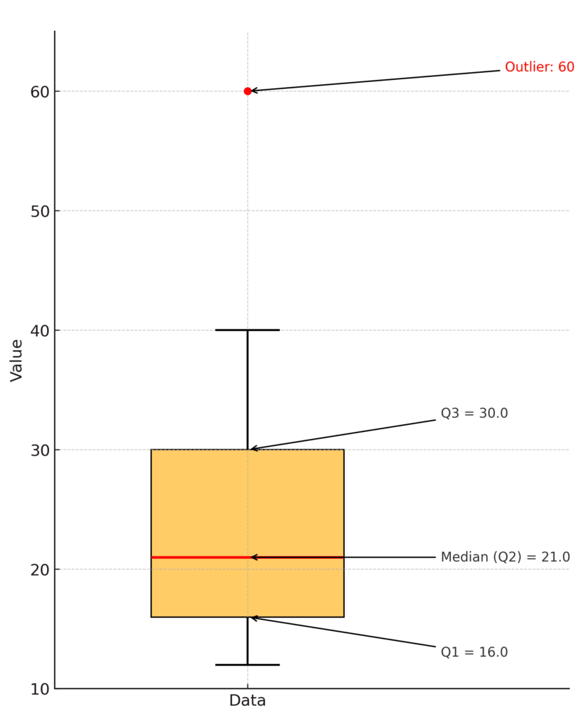
A box plot lets you quickly spot whether data is symmetrically distributed, skewed, or if there are any outliers.
Common Mistakes Beginners Make in Statistics
- Relying Only on the Mean: The mean is a useful measure, but it can be misleading when your data includes outliers. Always check for outliers and consider looking at the median as well, especially if the data is skewed.
- Ignoring Data Spread: Knowing the average alone is not enough. Always examine the standard deviation or variance to understand how spread out the data is.
- Misinterpreting Standard Scores (z-scores): A common misunderstanding is thinking a z-score simply shows how "good" or "bad" a score is. Remember, a positive z-score means above average, and a negative z-score means below average — but context matters. In some cases, being far from the mean isn't necessarily "better."
- Mixing Up Variance and Standard Deviation: Since variance is the square of standard deviation, beginners sometimes confuse the two or use them interchangeably. However, variance and standard deviation express different ideas numerically and have different units. Use standard deviation when you want to describe the spread of data in the same units as your original measurement.
- Forgetting to Visualize the Data: Statistics are not just about formulas — they are about understanding. Looking at a data table alone can hide important features like skewness or outliers. Always use graphs like box plots, histograms, or scatterplots to visualize your data before jumping to conclusions.
By watching out for these common mistakes, you will strengthen your understanding and build a strong foundation in statistics.
Quick Self-Checklist to Avoid Common Statistical Mistakes
Before you finish analyzing your data, it's a great habit to run through a simple checklist.
This will help you catch common mistakes early and make sure your conclusions are reliable.
Here’s a quick self-checklist you can use every time you work with statistics:
1. Did I check for outliers?
☑ Look at the minimum and maximum values.
☑ Use a box plot or histogram to spot any unusual values.
2. Am I using the right measure of center?
☑ If there are extreme outliers, consider reporting the median instead of just the mean.
3. Have I looked at the spread of my data?
☑ Check the standard deviation to see how tightly or widely the data is clustered around the mean.
4. If I compared different datasets, did I standardize them?
☑ Use z-scores when comparing data from different scales or tests.
5. Did I visualize my data properly?
☑ Create a box plot, histogram, or scatterplot to better understand patterns, skewness, or gaps.
6. Am I interpreting results carefully within context?
☑ Remember: A high z-score or a wide spread is not always “good” or “bad.” It depends on what you are measuring.
Keeping this checklist handy will help you build good habits and avoid many of the small errors that trip up beginners.
The more you practice, the faster these checks will become second nature!
Conclusion

Statistics isn’t just about crunching numbers — it’s about thinking critically and looking deeper into what the numbers are really telling you.
By understanding the mean, standard deviation, z-scores, coefficient of variation, and box plots, you’ll be well on your way to mastering basic statistics.


コメント